From concept to reality
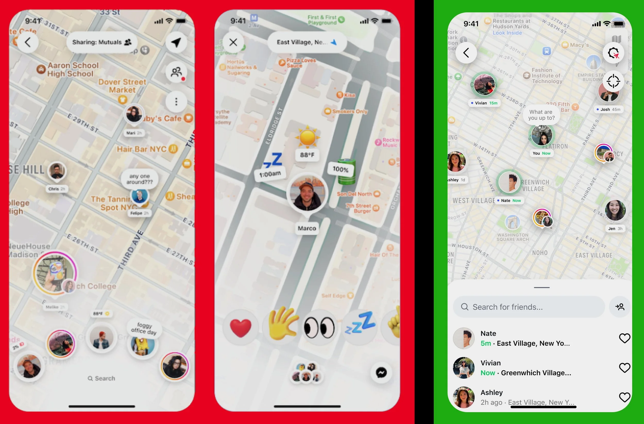
On the left are some of the original flows my team and I inherited for the main page when a user begins to interact with the Instagram map.
Old
Audience share status
Request button sandwiched between location and settings
“Fanned” friend view
Status emojis
Reaction emojis
Final
Share status minimized to gear tooth icon
If toggled on, share status simply says “Sharing location”
Request button moved to search bottom sheet
De-cluttered map view area
List friend view
Simplified and matched to brand expectations
Reaction/Status emojis removed
Unnecessary feature cut
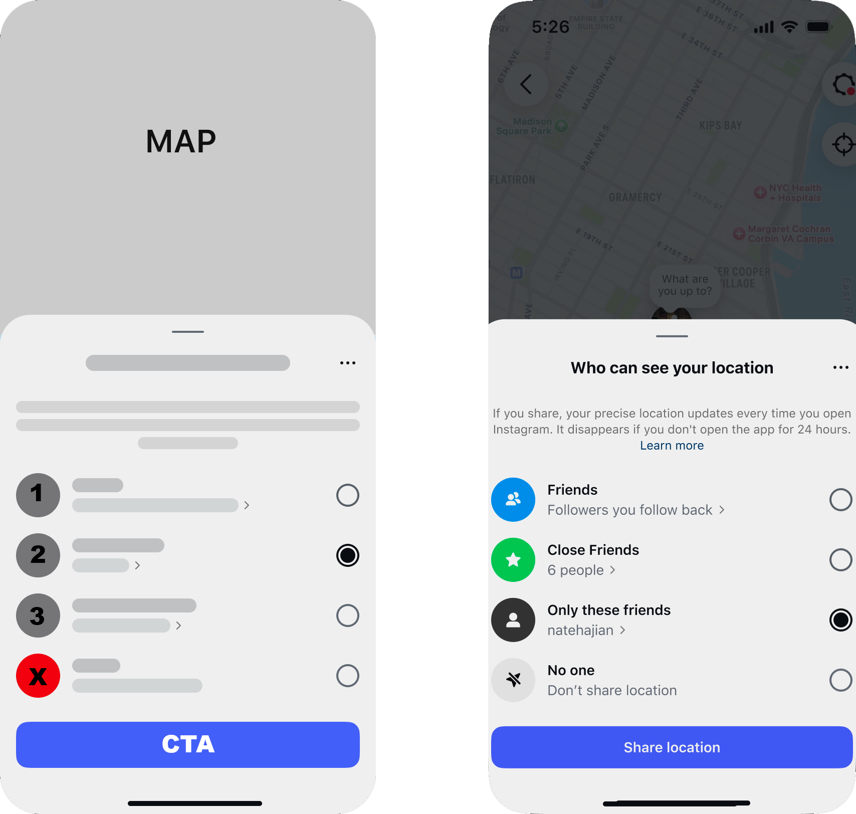
From inception to launch this one screen went through multiple revisions. My process for streamlining it was to understand user intent at all stages while also showcasing unique selling points.
Switching to “Sharing location” produced more serious message for users, they are currently broadcasting regardless of audience. The focus had to be recentered to the main issue.
Letting the map be the star of this screen became a clear goal, so moving as much information out of the map’s field of view became essential.
There are no surfaces on Instagram where friends/followers are displayed in a fanned/bouquet way. Matching with brand expectations may be less dynamic and fun, but keeping a clear UI/UX is more important, especially with a new feature.
Adding too many features like quick status updates and emoji reactions can conceptually seem like an enticing feature, but in practice it can be off-putting and useless. Giving users the option to update there location “note” through regular means was more important than introducing a fun new interface.
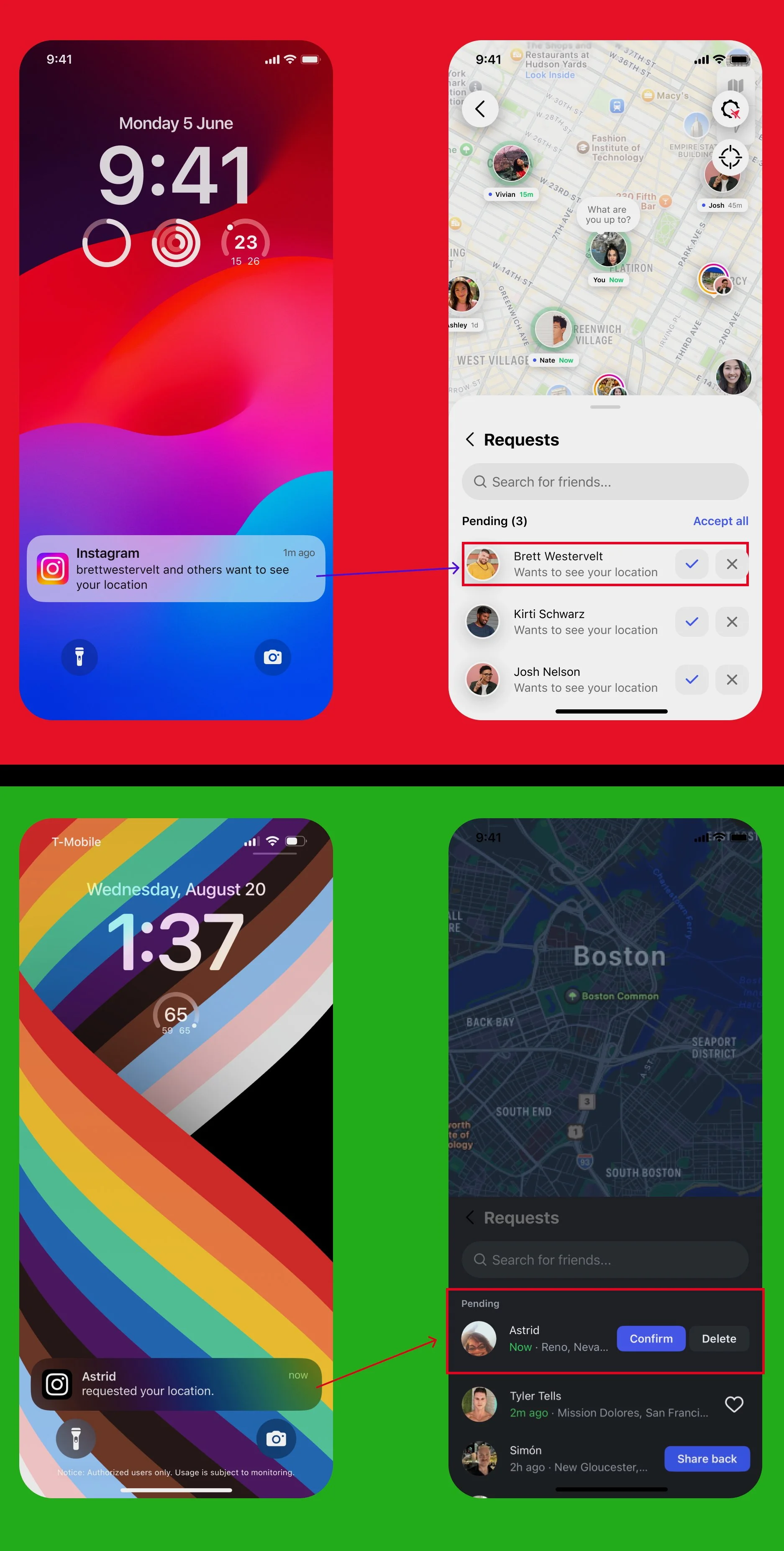
Flow corrections and notification governance
Changing the notification settings to lead with a friend’s name rather than the app’s name was important for two reasons. 1. This creates less of an association with Meta wanting a user’s location. 2. The Instagram logo is well known enough that calling out the app was unnecessary.
The original request page had two issues. First, the “check” and “X” options could lead to user confusion, specifically the “X.” What does denying this request mean for your follower status, audience reach, and future requests. Changing the CTA to “Delete” made it clear this action pertained to this one request instance.
Second, updating the copy “Wants to see your location” to the requester’s shared location again reinforced safety and trust between users.
Humble beginnings
Early wire frames for what was originally called “Friend Map” began over a year before the feature launched to the public in Summer of 2025. The team’s first concern was audience and privacy. I created a wire frame for what would eventually be the bottom sheet on the right.
I did not reinvent the wheel. This wireframe was based off of current Instagram sharing screens and other privacy documentation. By understanding the product and policies, I was able to create something brand new which was still grounded in the brand’s current UX.
Our impact has been measured as user retention increasing from 2.5% to 10% after 10 weeks. Also, users who interact with content are up to 2x more likely to return.
Daily active users: ~35M (3% of total DAU)
Instagram Special Moments
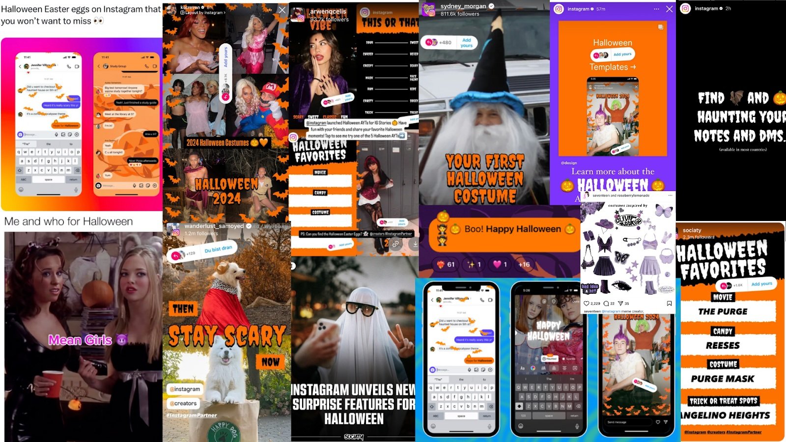
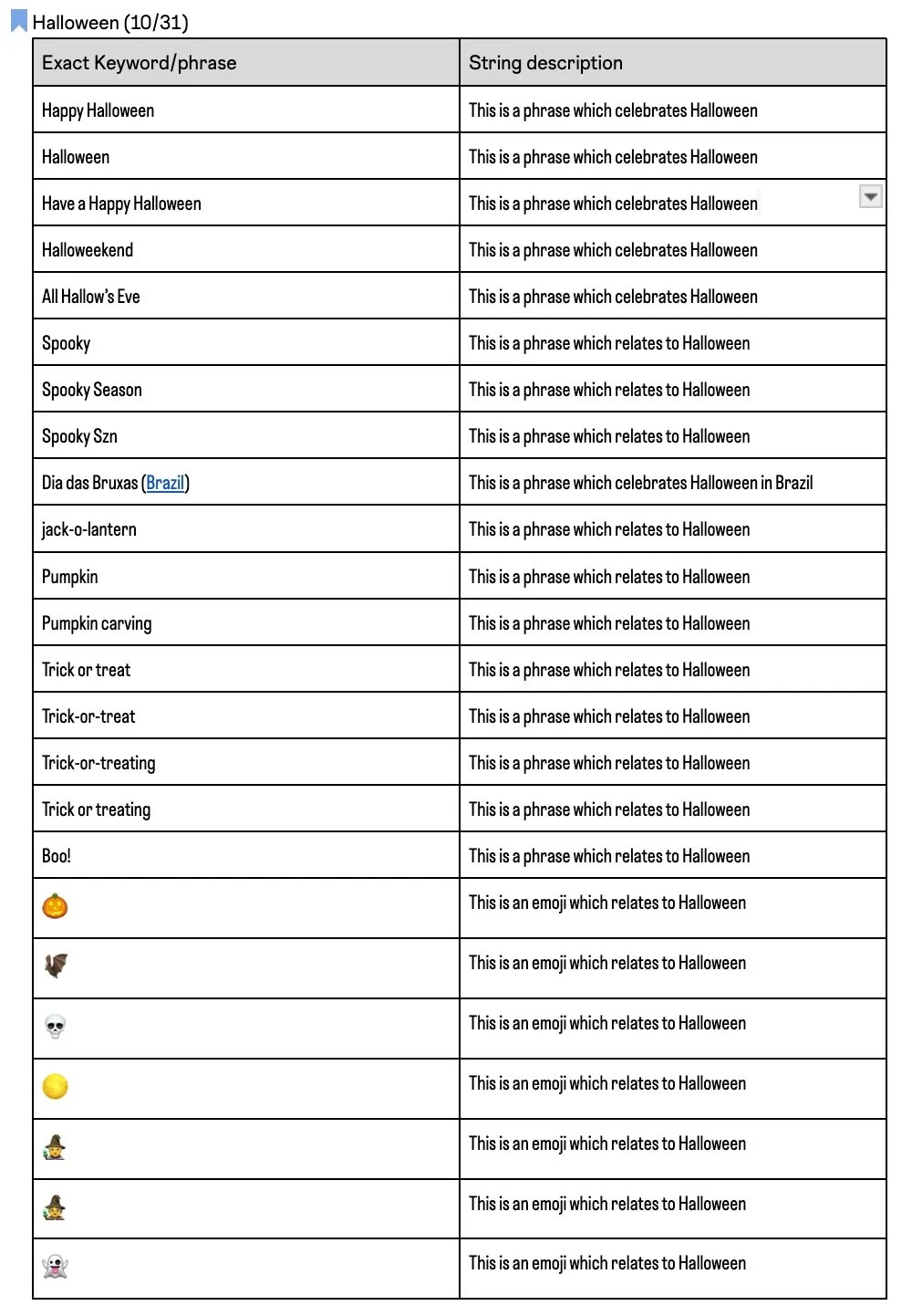
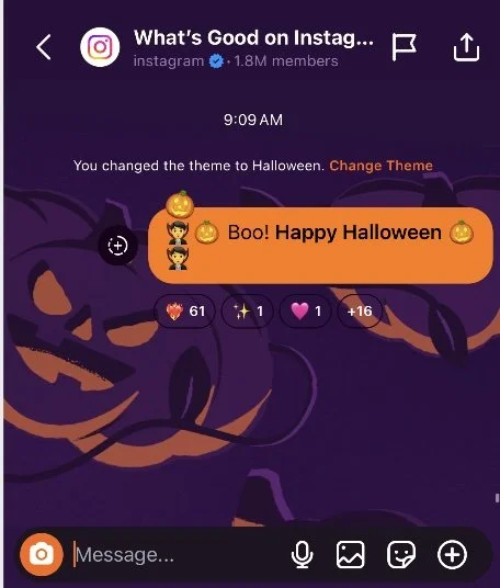
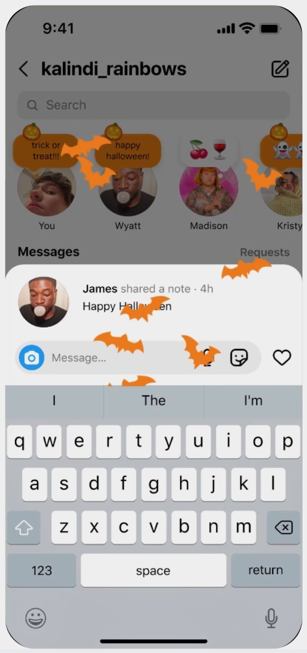
Instagram users more than anything are visual people. To enhance their app experience and reward their image drawn eye. The “special moments” team and I launched a list of terms which would pop around Halloween 2024
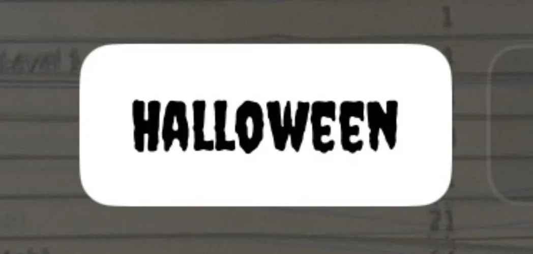
With engineering help we also implemented a limited time “Halloween” font which I was able to name. Other names considered were “Spooky,” “Spectral,” & “Creepy.”
In a messaging use case on the left, we can see the implementation of a few pieces of work. The Halloween background theme, the orange “Send Image” icon, and of course the orange message with a key term bolded. From a design standpoint it was vital that these integrations be fun and visually dynamic, whilst not interrupting a user’s expected messaging flow.
The same can be said with “Notes” on the right. When entering a term the user would receive animated bats, which would obscure their view partially, but for a brief time. Once posted the note would be orange and be tagged with a Jack-O-Lantern emoji.
In the end, this activation saw a total reach (on-platform): 108.3M and a +2% lift in DAU for the notes feature.