
Google notes
Google notes, was a search labs experiment which ran from 2023 to 2024. This feature allowed users to comment on Google links and provide insight into what helped them about said result.
When I was affected by lay-offs with Google, I was not able to export my work in the highest fidelity. Below you will see some original screenshots and my recreations with my own Figma components.
The first place a user would interact with notes (if opted into search labs experiments), was on the search result page or SRP.
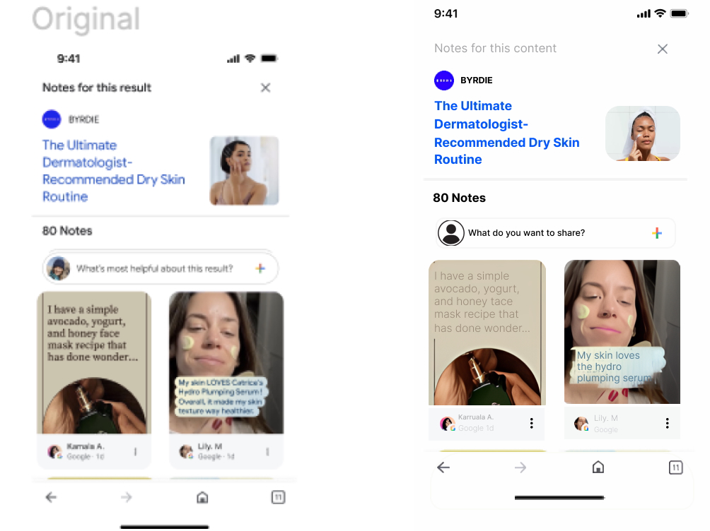
My task was modifying the placeholder input field. “What’s most helpful about this result?” felt equal parts rhetorical and sterile. Through a combination of UXR and writer’s intuition I was able to craft the new input field.
“What do you want to share?” has a more inviting and playful tone which allowed users to feel encouraged and less taxed by the prompt.
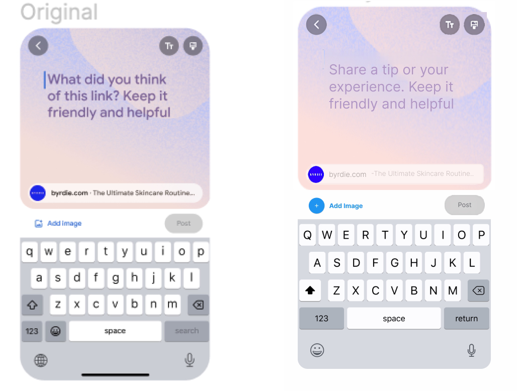
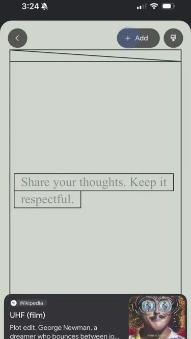
Prompting a user into creating a note was just the beginning of the user journey. Once a note had been created, my team and I figured guiding text would be more inviting than staring at a blank canvas.
Once again, the PD/Eng placeholder of “What do you think of this link?” felt cold and obtuse. It communicated in a way which was unnatural, and for that reason, off-putting. However, the search team had long agreed the overall message for notes should be friendly and helpful, so that copy was not thrown out.
Again, being a gentle guide for the user through this new experience was crucial in creating an experience users would want to return to.
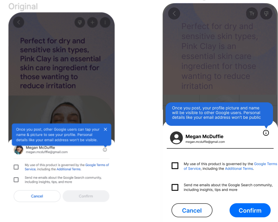
No one’s favorite part of onboarding screens but important, nonetheless, tooltips can be a vital resource for reducing clutter but ensuring users can still be well informed.
The original tip was both concerning and vague. By stripping the text down to communicate what many users already know about public posting, I was able to make the idea of posting less daunting. Also, a simple change like visible to public can reinforce the main idea of the text.
More notes work

I began this project by naming the themes which would be the basis of each note created. See the purple gradient background above, which became known as Tie-Dye. This involved creating a deck outlining the brand motives and then of course some creative thinking. I worked with marketing, other UX Writers, and our internal strategy team to vote on the options I created
The bold entries are ones which made it to the review/approval round
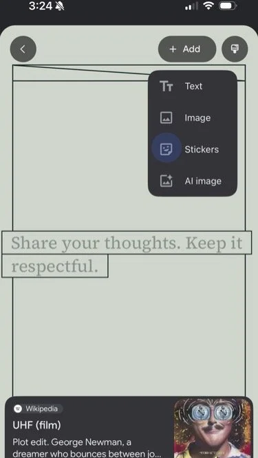
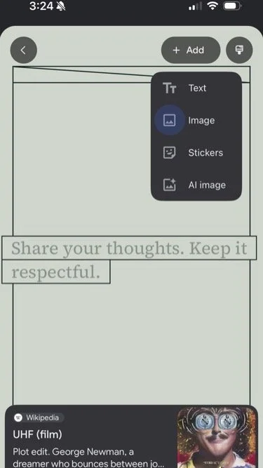

With my dual role as a content strategist, I was tasked with developing the visual add-ons which would be possible in the notes creation menu. I leveraged my time working with Google Images, Licensed Media Services, and the GIF Keyboard to begin developing the market standard expectations while also adding a unique twist.
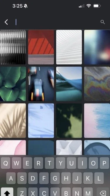
Image selection would provide the option for camera roll content or stock content. This allowed for us to give users a chance to be more creative and stand out more wether they took a picture of how a Google link helped them or not.
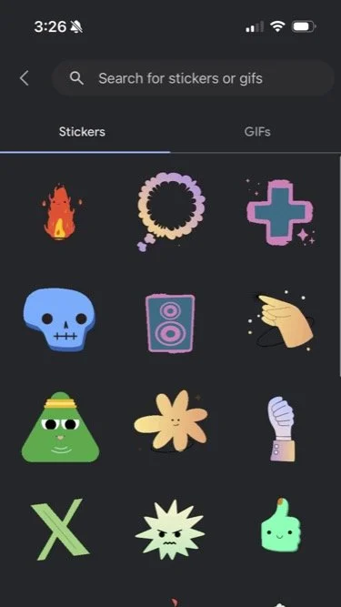
Stickers, of course could be added to any note for enhancement or expression. I managed a team of animators to create wholly owned Google stickers which covered the most common reaction types (thumbs up, fire, etc.) while also creating assets which spoke directly to the notes use case.
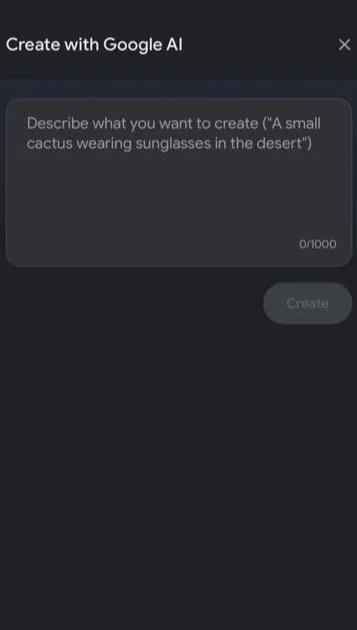
Last, it was 2023, so we had to include Google’s new AI creation tools as a showcase for the technology and as an extension of it becoming a more common practice with each passing day.